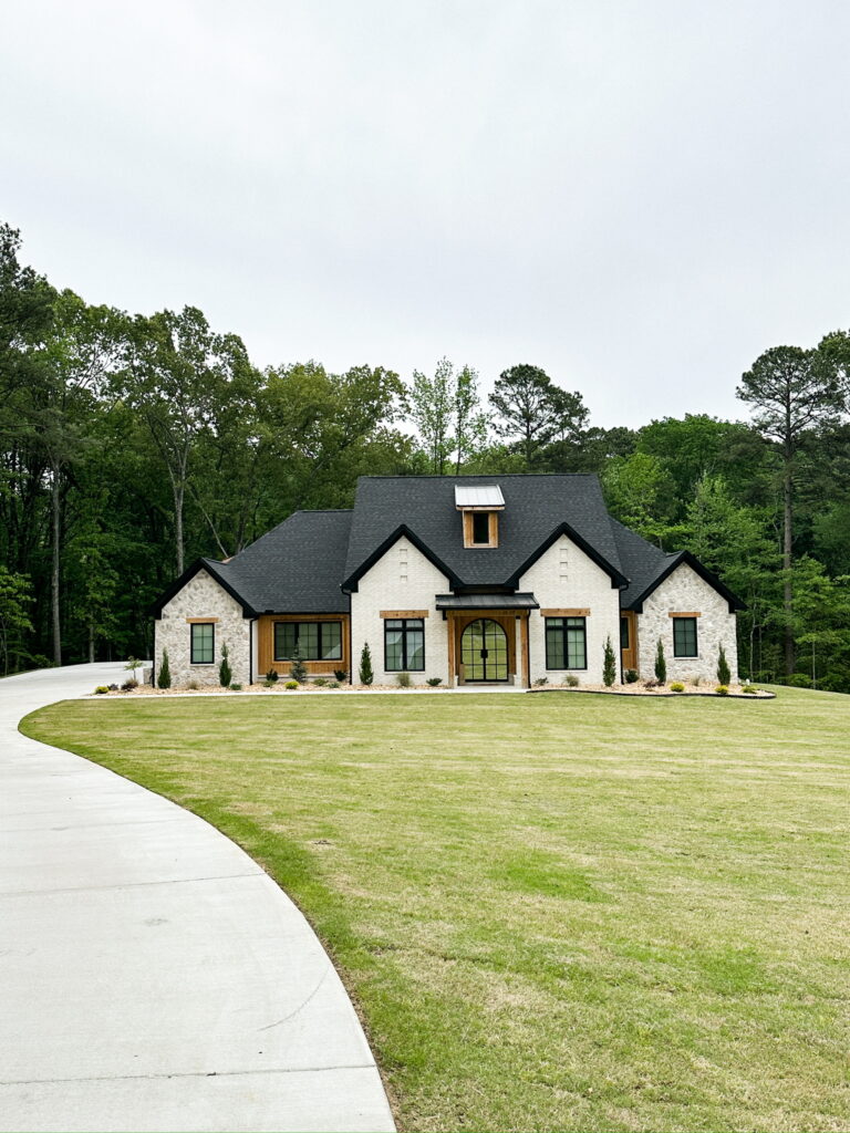
We built a house and could not be more thrilled with how it turned out! A few years ago, I decided it was time to change professions and took a job working for a Contractor/ Home Builder. Over the last couple of years working for them and building our dream custom home, I have learned some of the ins and outs of building a custom home. I want to start sharing my knowledge with you, but for now, here is the long-awaited unveiling of Casa De Diaz!
Lighting Links:
Living Room & Dining Room Design
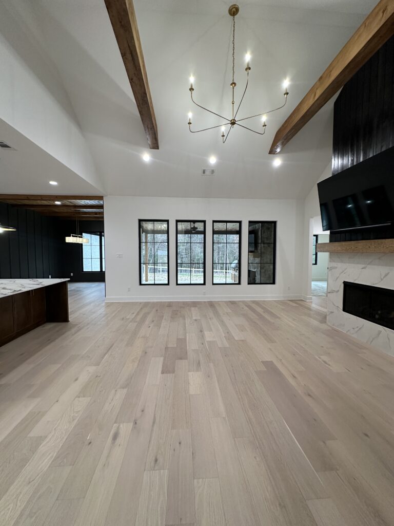
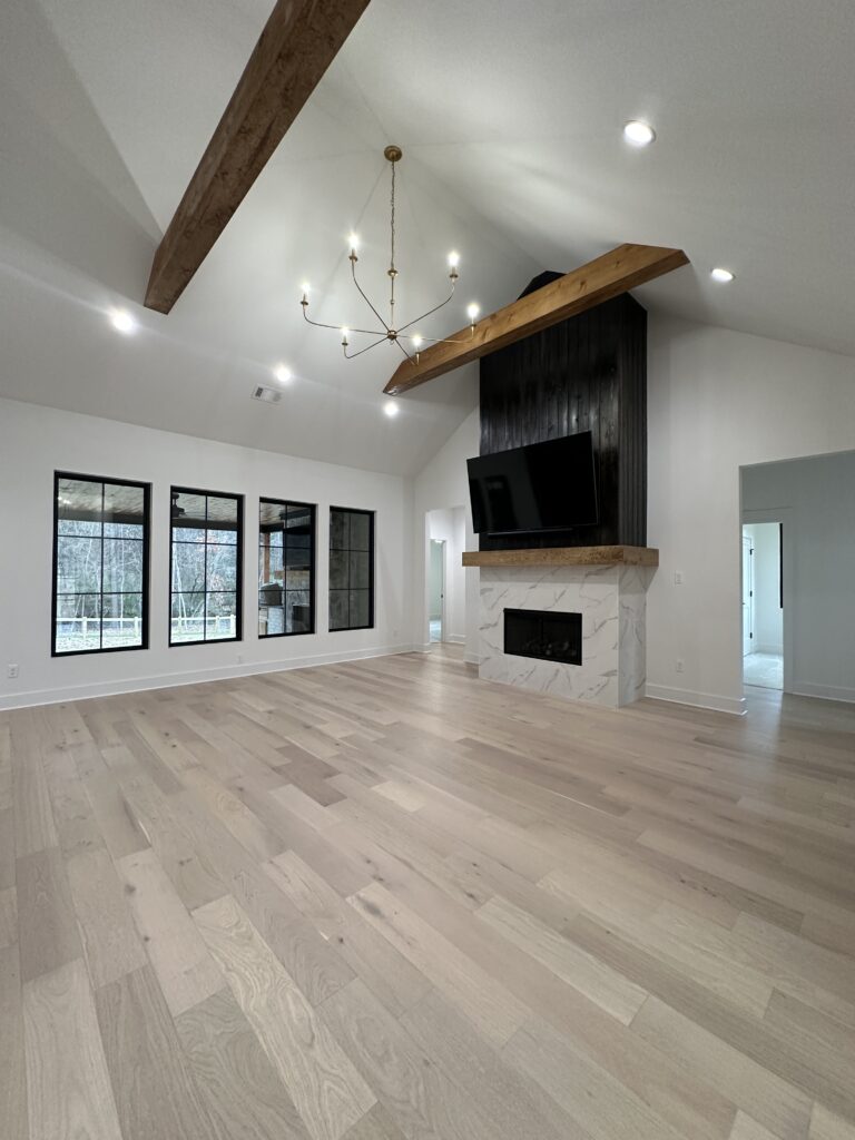
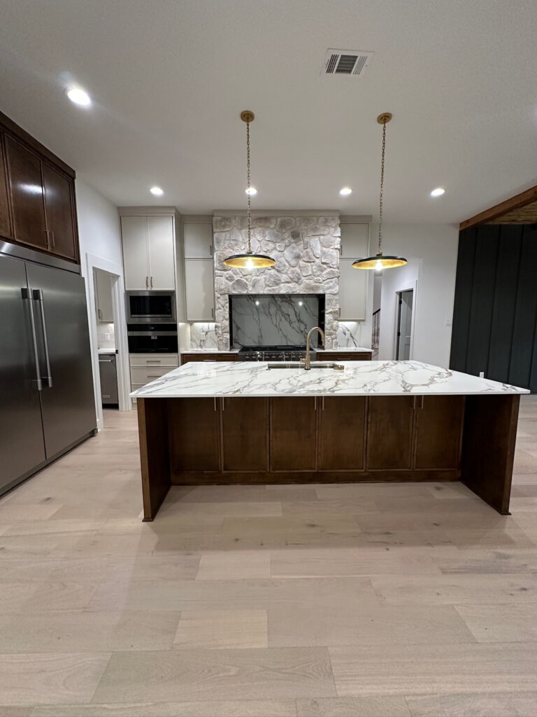
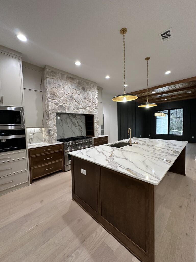
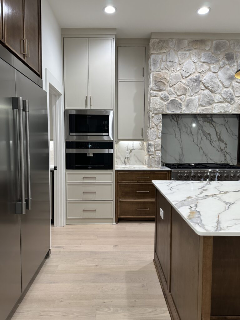
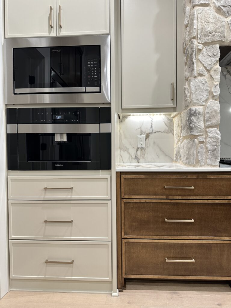
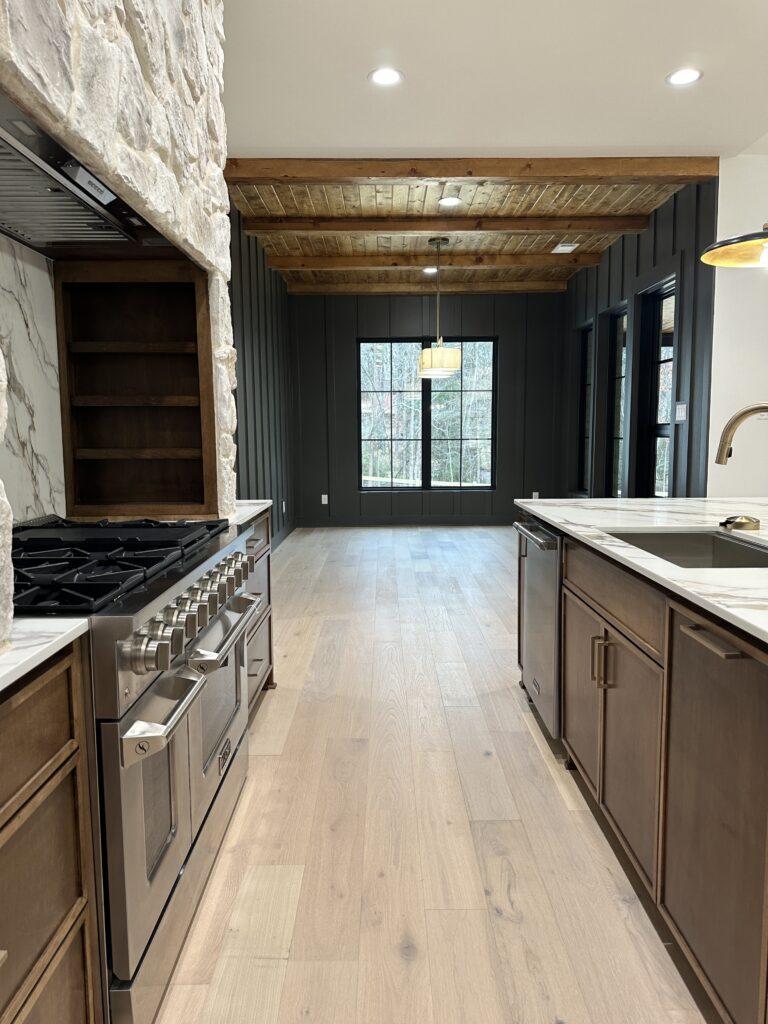
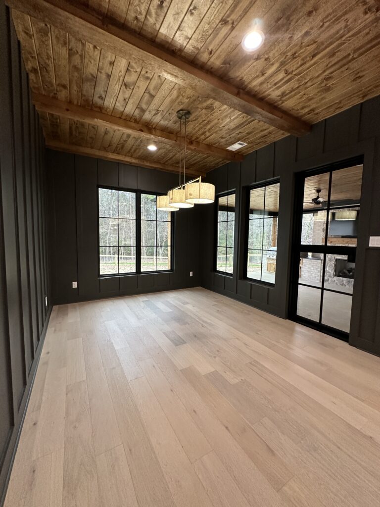
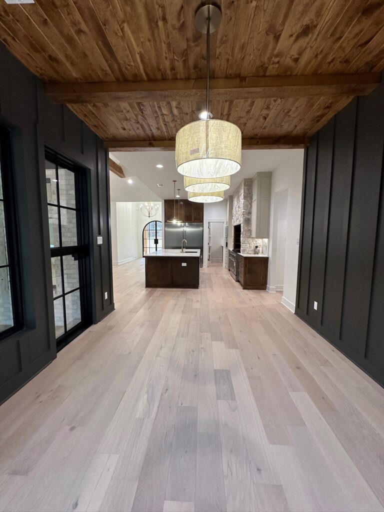
We did engineered hardwoods throughout our living room, dining room, office, and master bedroom. In our living room and kitchen, we opted to bring a couple of the elements from the exterior of our house into the interior. Our vent-a-hood over the range is the same stone that we used on the exterior. The wood above the fireplace is leftover cedar tongue and groove siding from the exterior of the house that we just stained black.
We drew a lot of inspiration from The Lifestyled Co., which is an interior design firm out of Arizona that specializes in an “Organic Desert Living” style. We also love a lot of European design elements and tried to incorporate some of those styles into our design as well. Chris and I both love very earthy and moody colors and mixed organic textures, so you will see that reflected throughout our home. I would probably say our style is something like an “organic modern cottage.”
Appliance Links:
Casa De Diaz Master Bedroom Design
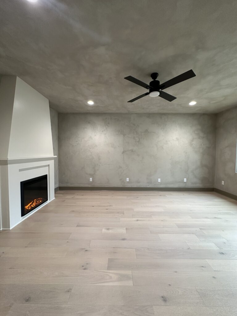
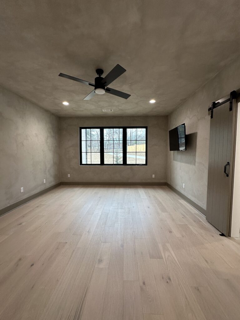
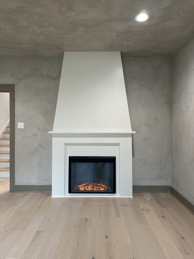
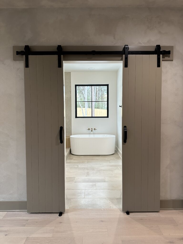
Our master bedroom is one of our favorite rooms in our house! When we first started planning our home, we knew we wanted to find a way to incorporate the fireplace mantle that Chris and his Papaw built together. We said our vows in front of that mantle and we had just lost his Papaw the year before. It didn’t match the style of house we were going for at all, but it had so much sentimental value that we could not part with it. I showed a picture of what I was thinking to our contractor and trim guy, and they were able to make it happen.
We used lime wash paint on the walls and ceiling to create a textured look. This room was actually one of the ones we painted ourselves, so it was a labor of love. We had a few late nights and a Waffle House dinner or two while painting it. Our backs and shoulders may have been aching, but we love how it turned out and will never forget those memories we made while painting it.
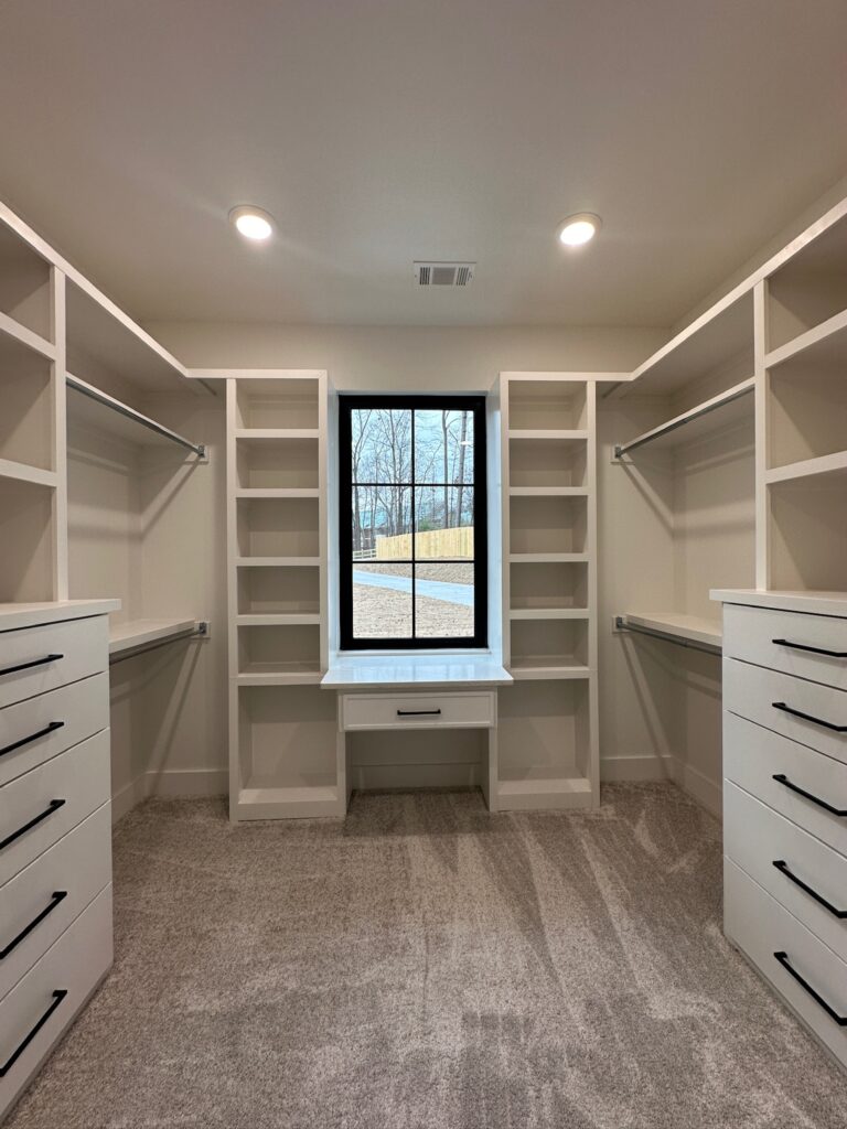
Master Bathroom & Closet
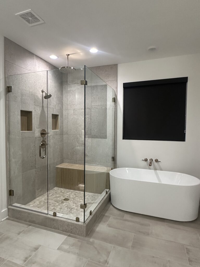
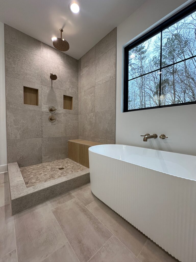
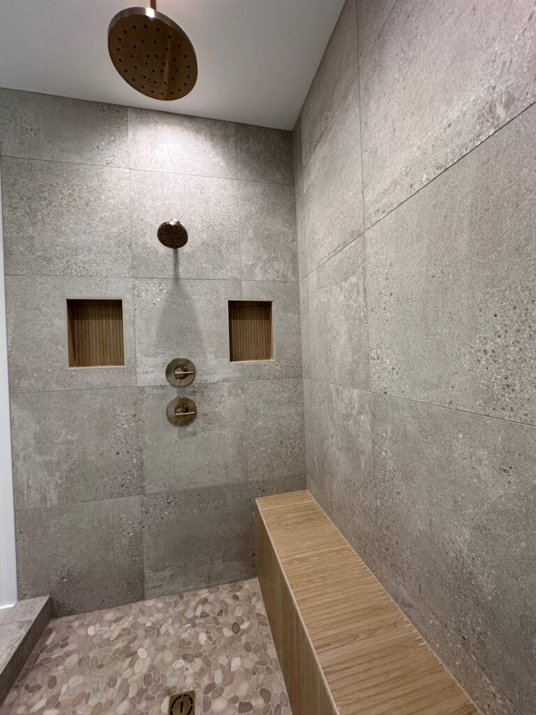
For our master bathroom, I had seen this ribboned wood tile that I had fallen in love with and knew I wanted to use it somewhere. The tile gives off a spa/ sauna vibe, so I thought, why not use it in our master shower as an accent piece? So, we used it to create the shower bench, which ended up looking like a sauna bench. We paired it with other natural-looking elements like the river rock floor and the concrete tile for the sides.
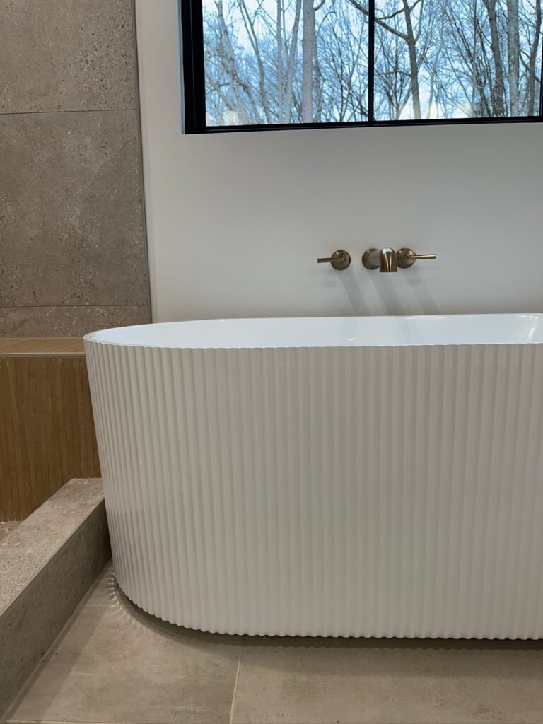
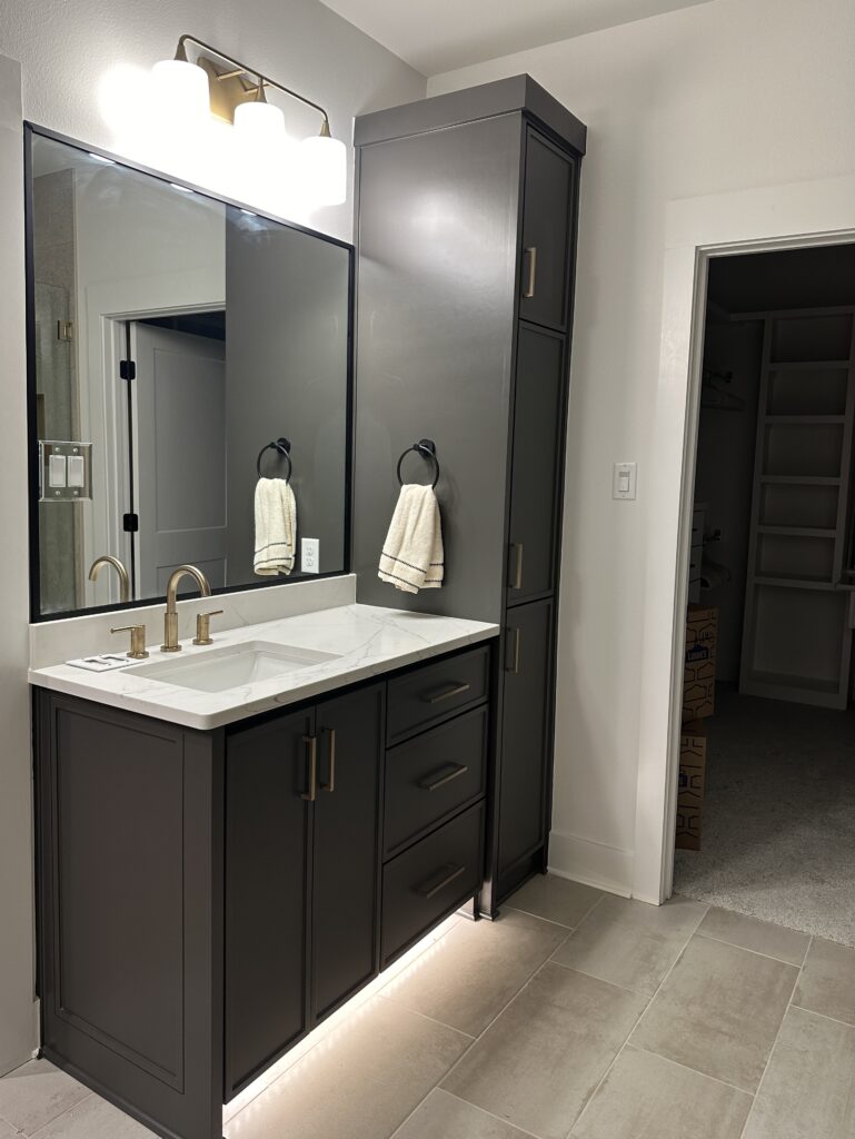
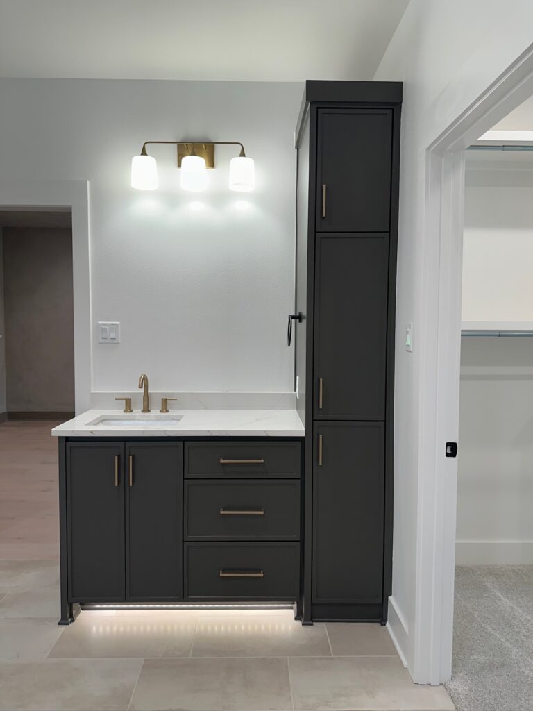
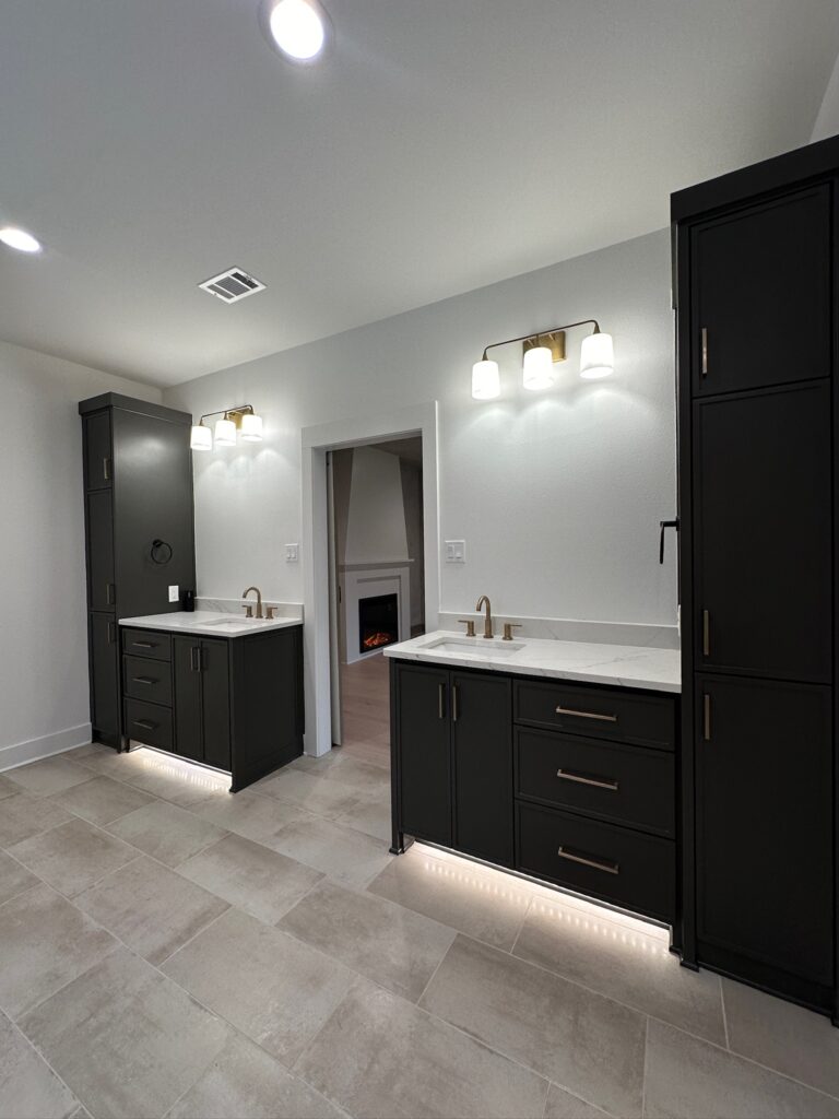
Our master tub is a literal dream! It has fluted detailing along the sides, and we love how it looks! Our last home did not have a tub, so we have been so excited to be able to utilize it. All of the plumbing fixtures in our home are in the color Champagne Bronze from Delta. All of the bathrooms have under-cabinet motion detected toe kick lighting. This makes it so that when you walk into the room, a light under the cabinet turns on. A very helpful feature at night, plus it creates a cool ambiance!
Plumbing Links:
Laundry Room
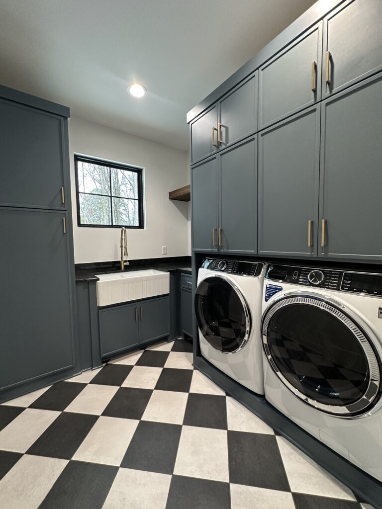
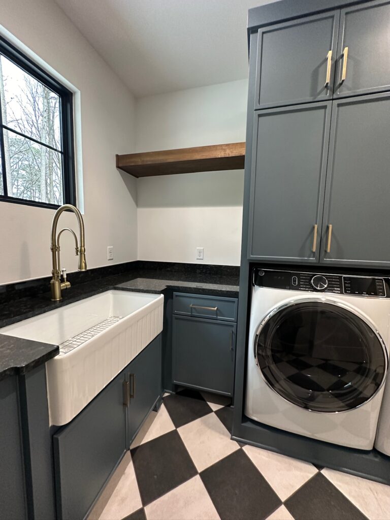
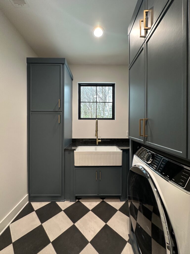
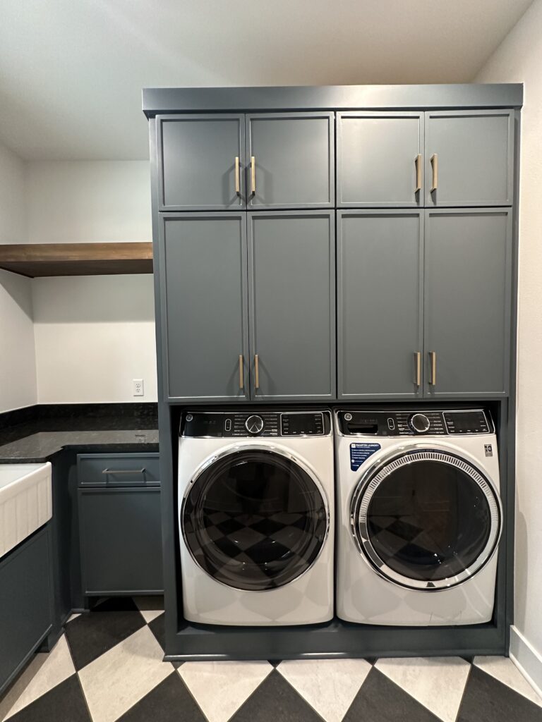
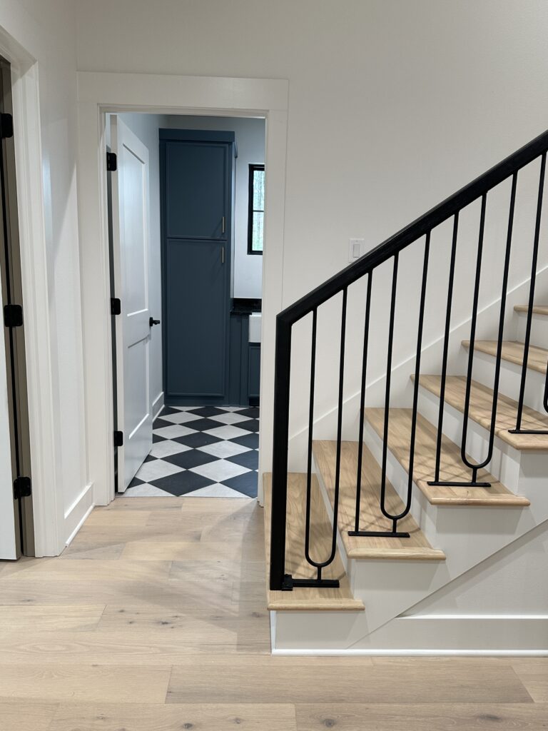
If there is one thing I love, it is to make a statement with tile! I’ve seen people say that checkered flooring is trendy, but I strongly disagree with that. Checkered flooring has been around for ages, and if done correctly, it can be stunning and timeless. The key to checkered flooring is to make sure that the products you are using have some texture or movement to them. Making sure it has texture or movement gives it a more subtle and toned-down look, which creates that timeless feeling. It also helps keep it from looking too much like a checkered flag and giving the race car vibe.
When we were drawing the laundry room up, we got a little nervous about how many cabinets there were. Our biggest concern was that we did not want it to be too claustrophobic. We were concerned that the cabinets would make the room feel small. We also went back and forth on whether to put a sink in or not. One of my friends told me we would regret it if we did not. Let me tell you, I am so glad we took her advice, and I am grateful we kept all of the cabinets. That sink has been used to soak so much stuff! It is such a game-changer! We may not have filled the cabinets up all the way yet, but that just leaves plenty of room for storage as our family grows.
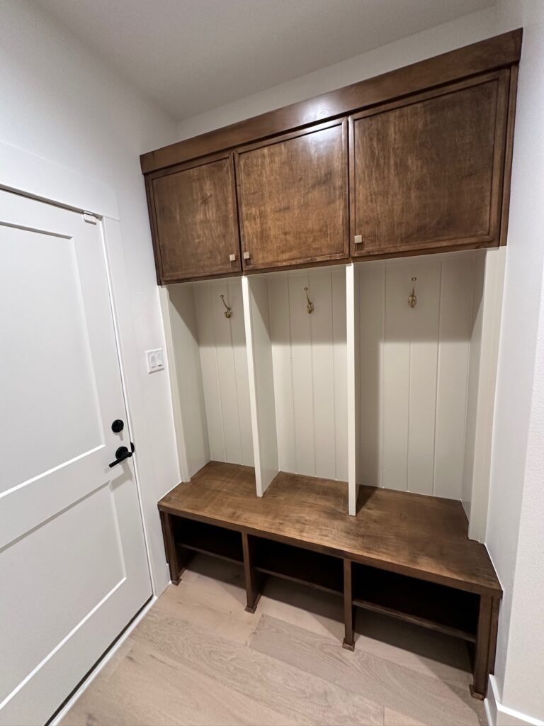
Office/ Library & Mud Lockers
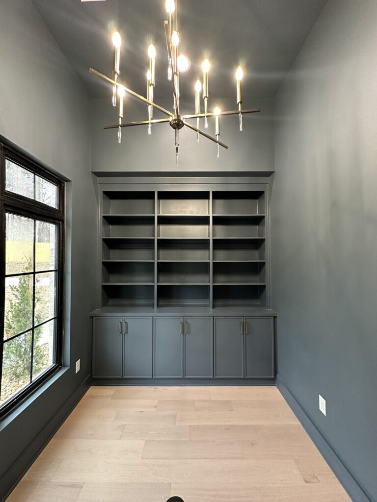
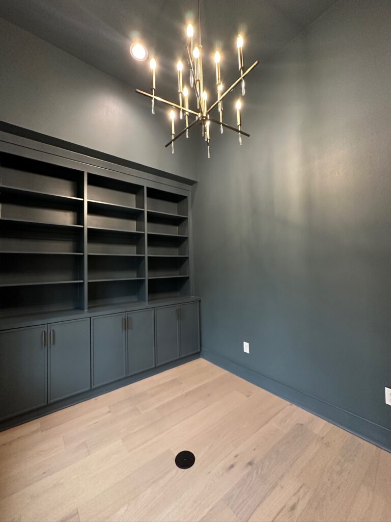
Our office is a smaller space, so we wanted to make sure we found a way to utilize it properly for our needs. I am a huge reader and love books, so we included custom bookshelves for all my books. We also included cabinets below the bookshelves to make sure we had room for storage. Inside one of the cabinets, we even included an outlet and pull-out drawer that houses our printer so that it would be hidden. We also decided to include an outlet in the floor so that you could plug your computer in there and not have cords running everywhere.
Casa De Diaz Bathroom Designs
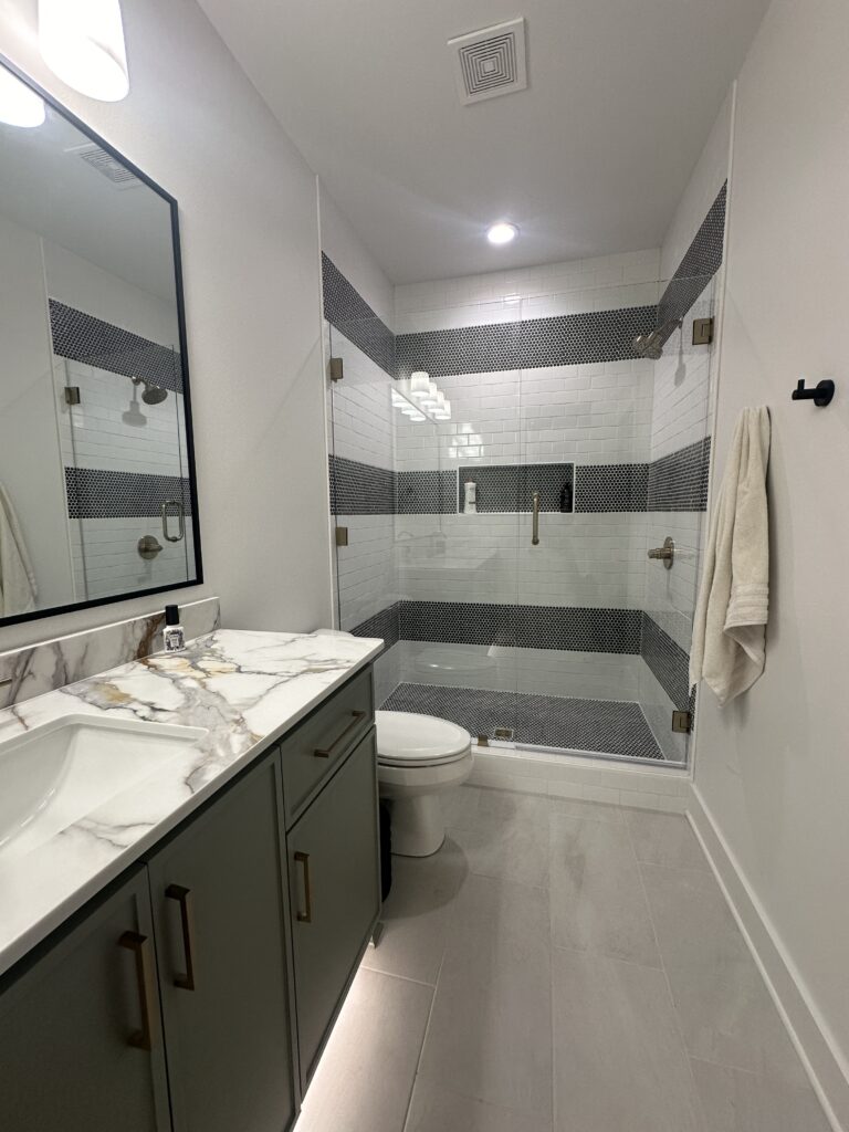
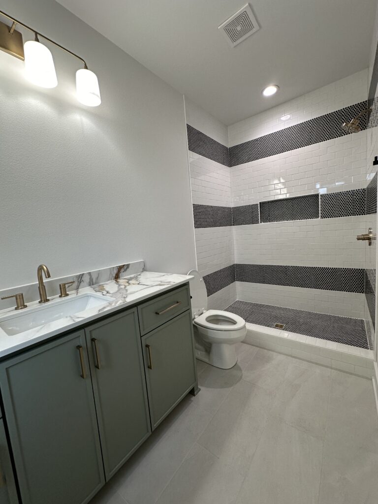
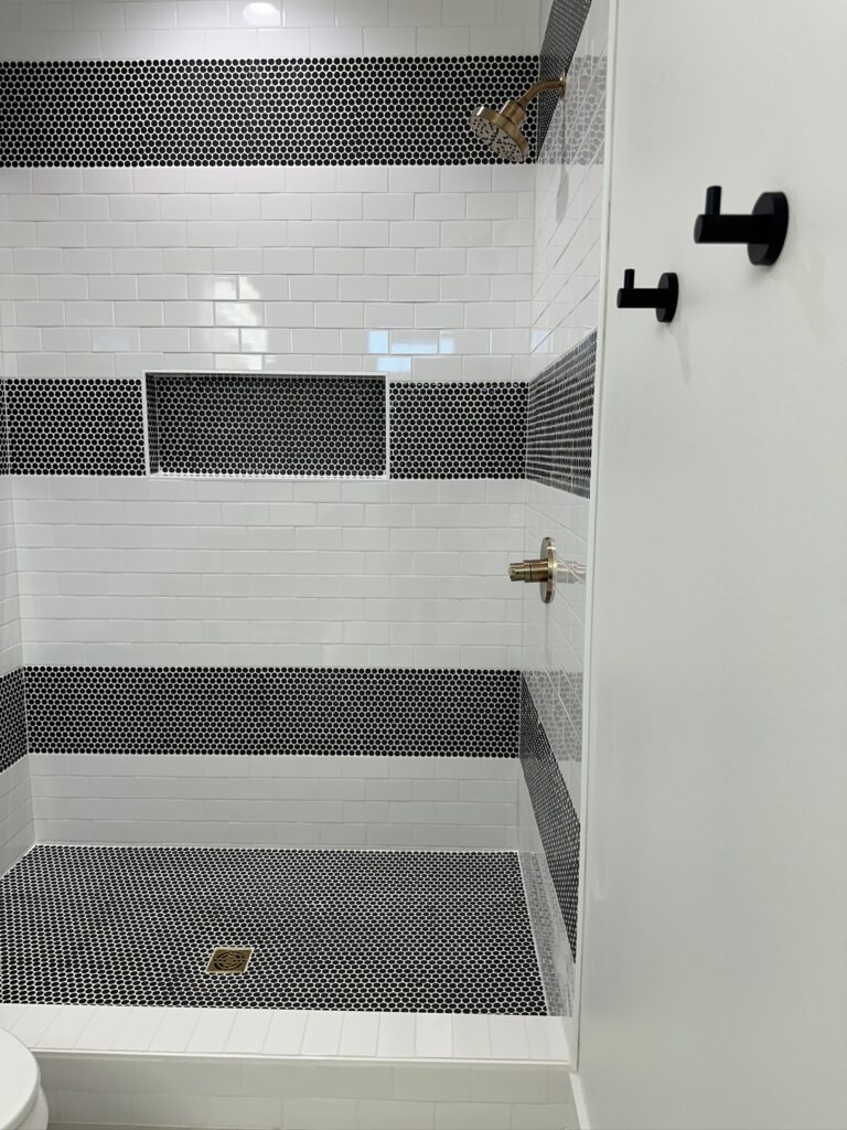
Guest Bathroom Design with Striped Tile Shower
For our guest bathroom, the original tile I had picked out was out of budget. We just weren’t finding anything that was going to give us the look we wanted. So we went back to the drawing board, and I did some research. I was inspired by the striped tile patterns people were doing and thought white subway tile is one of the most affordable tiles. So we created this look using them and some black penny tiles. Like I said before, I love making a statement with tile, and this turned out so good!
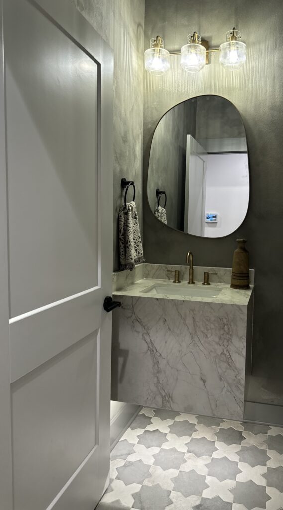
Moody Powder Bath Design
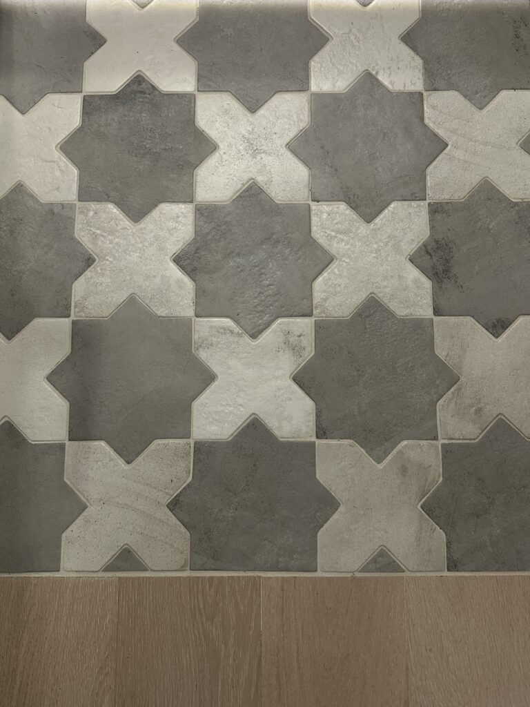
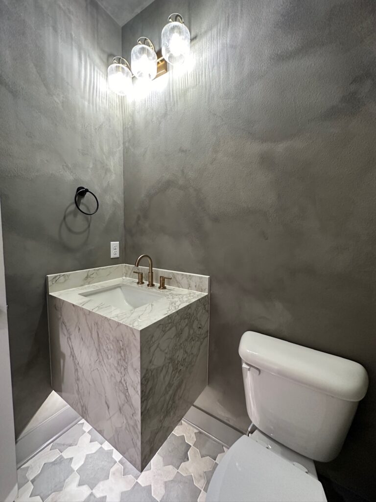
I LOVE a moody powder bath! They are usually such small spaces that can pack a big punch. We did a dark gray lime wash in here. We painted this room ourselves, too! I knew I wanted the sink to be a focal point and the flooring to make a statement. For the sink, we ended up using some countertop remnants that had a lot of veining and looked marbled. For the flooring, we did a grey and white star and cross tile. It was honestly a toss-up if all the grey shades would go well together. We didn’t have paint swatches to hold up to the countertops or flooring when we were picking them out. But it came together perfectly! The grey colors and the cream colors were the perfect toning for each other!
Kids Bath Design with Green Tile
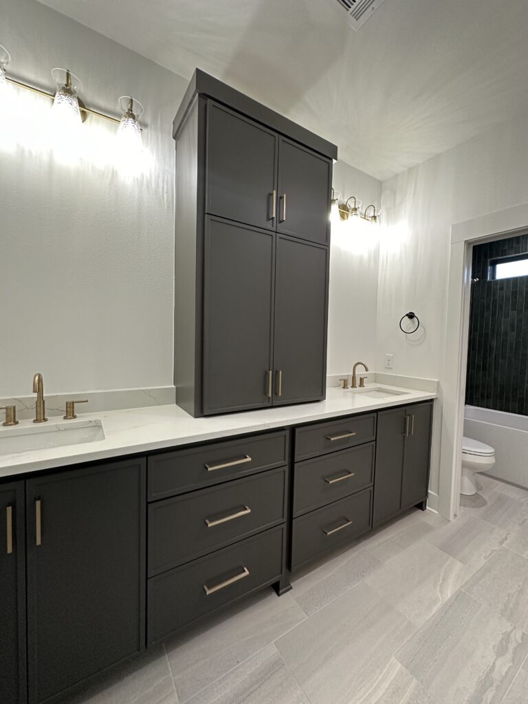
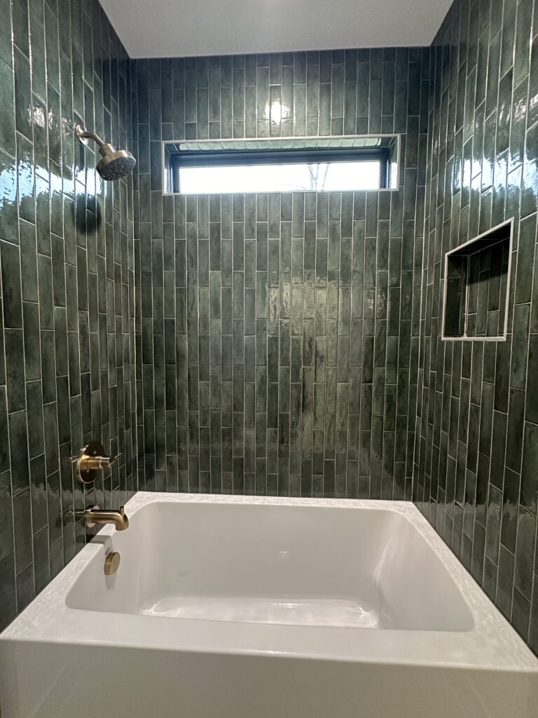
In the final bathroom, we knew we wanted it to be something that could be functional for growing a family. We did a large vanity with custom cabinets that divide both sinks and give each side an equal amount of space and storage, to hopefully cut down on arguments. There is a pocket door that divides the vanities from the shower and toilet area. This allows someone to be showering while the other is getting ready. We opted for a fiberglass tub, but I knew I wanted to tile the surrounding area to make it more aesthetically pleasing. When we saw this green tile, we knew we wanted it somewhere in our house, and I think we picked the perfect room for it. The green looks stunning with the cabinet colors and the champagne bronze plumbing finishes. Honestly, the pictures do not do this tile justice!
Plumbing links:
Casa De Diaz Outdoor Patio
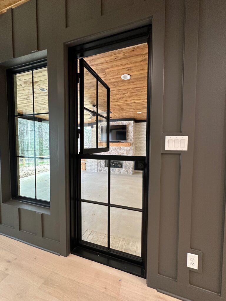
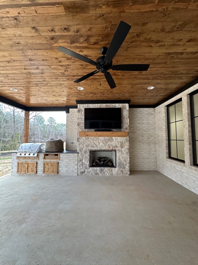
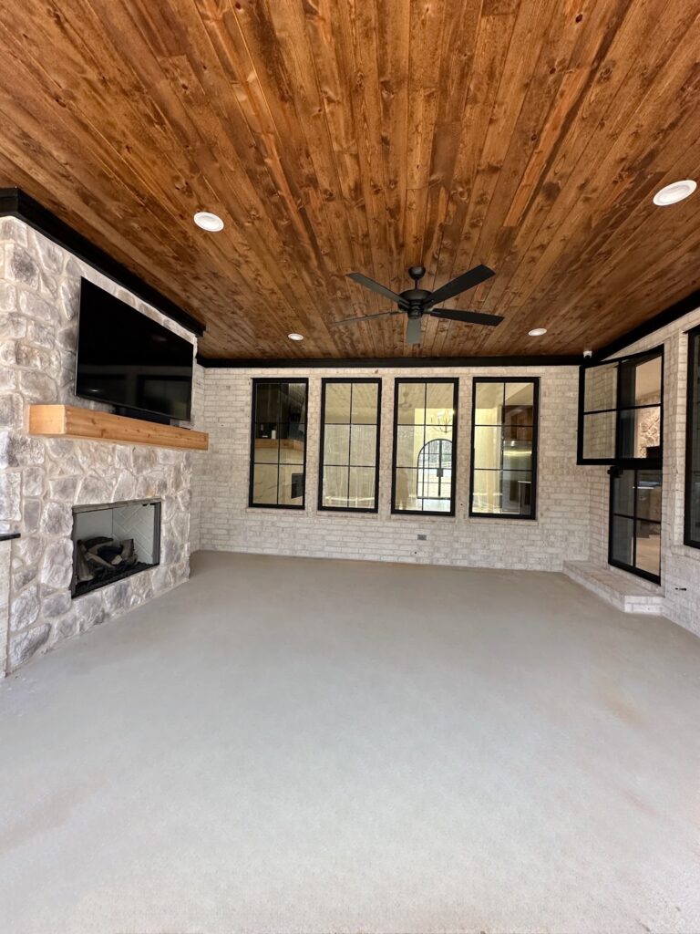
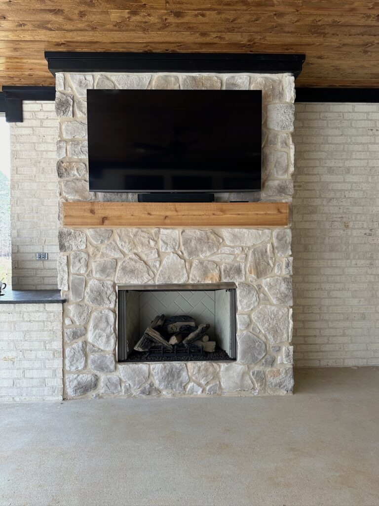
The back patio is the perfect spot to enjoy being outside! We used the same stone from the front of the house on the fireplace and did pine tongue and groove ceilings. I am obsessed with the wood tones with the stone, brick, and black accents! We also decided to do a grill and a pizza oven, and we are so glad we did both. But we LOVE our pizza oven and have used it so dang much! We did a Dutch door leading from our dining room to the patio, and it was such a good decision. You can open it and just hand stuff in and out while the dogs stay inside and out of the way. Or open it and enjoy some fresh air while you are at the dining table.
Appliance Links:
We get asked a lot if we could change anything, what would it be? And we honestly love the house we created so much! I’m sure over time, we will come up with things we want differently, but they will most likely just be cosmetic changes. Things like painting rooms we left white. We tried to be very intentional with the design and layout, thinking about our current and future needs. Overall, we love how it turned out and could not be more grateful! We are over the moon, and it has been such a blessing to share Casa De Diaz with family and friends. We look forward to sharing it with them for many years to come.


10 COMMENTS
Phoebe James
1 year agoHi your home is so lovely! We’re building in north Georgia and we are having a hard time finding a stone we like. Would you mind sharing the stone you used? Thank you!
admin
1 year ago AUTHORHi there! Thank you so much! We used a local vendor here in Arkansas called Atlas Stone. The stone we picked is an essentric stone veneer in the color snowy creek. Hopefully that helps!
Savannah
1 year agoI love the brick and stone colors! What is the name of the brick you used?
admin
1 year ago AUTHORThank you so much! The brick we used was called Belle Meade.
Gina
1 year agoHi, absolutely love your home, inside, outside, and all your choices, beautiful! Would you share your floor plan..looking for a ranch/ one story that I like and yours is perfect.
Thank you so much for sharing, Gina
admin
1 year ago AUTHORHi Gina! Thank you so much, that is so kind! We used plan #51874HZ from Architectural Design and got with a local architect to draw it up and make all the changes we wanted. If you haven’t checked out Architectural Design, they are a great resource for plans. You can use all the filters to narrow it down to save time too, because they have TONS of plans!
Rachael
12 months agoHi! What wood floor did you use? You all did such an incredible job on this home!!!
admin
11 months ago AUTHORThank you so much Rachael, that is so kind! They are engineered hardwood called Essence Oak in the color Hopewell.
Lindsay
11 months agoCould you tell me the stain color used on the exterior, and what wood type it is? Thank you!
admin
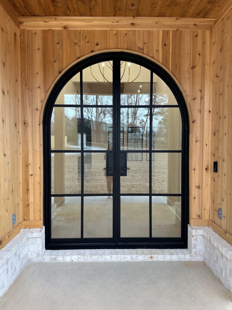
11 months ago AUTHORHi Lindsay! You bet! The exterior siding is a cedar tongue & groove and we did not stain it. We are currently letting it get weathered and then we plan to seal it. The tongue and groove on the porch ceilings are pine and stained with the color Early American.